Enabling screen-reader users to engage with a unique and highly visual digital art piece, while maintaining the integrity of the original work.

UX Design (Solution Design, Prototyping, Technical Documentation)
Myself, 2 User Researchers, 1 Designer
Apr 2025 - May 2025, 1.5 months, delivered
Overview
An Incalculable Loss is a significant piece of artistic journalism published by The New York Times that marks the first 100,000 American deaths resulting from COVID-19. Our client, Cooper Hewitt Smithsonian Design Museum is planning to include the piece in its upcoming collection of digital archives, and wants to ensure the experience is digitally accessible, particularly for blind or visually-impaired visitors.
I evaluated the accessibility of the existing piece, then designed, prototyped and documented specifications for an accessible, technically feasible framing experience to improve screen-reader compatibility for the piece.
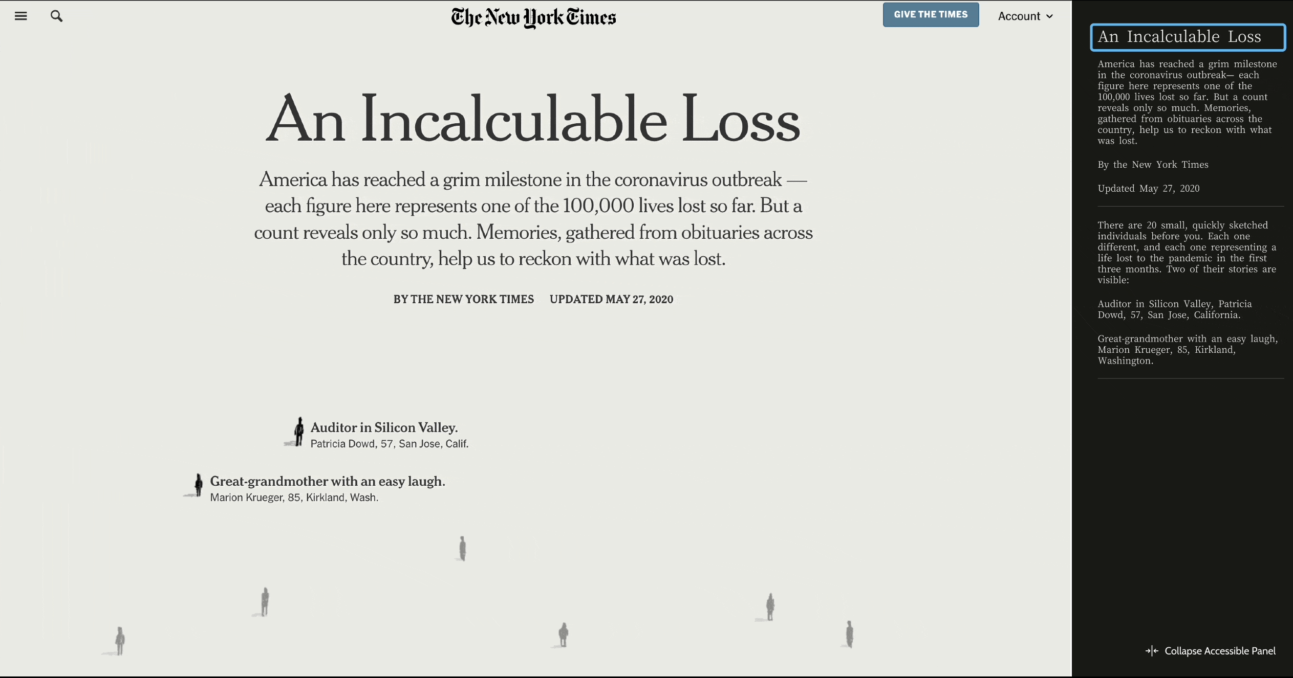
Cooper Hewitt asked our team to design a framing experience for the digital media piece, An Incalculable Loss, that
After discussing with our client, referencing the artwork's significance statement and experiencing the artwork ourselves, we determined the most important aspects of the artwork to make accessible to screen-reader users were
The Incalculable Loss piece is set to be displayed in an online gallery, primarily accessed by art students based in New York City. For those art students who are blind or visually-impaired, our team did some further research. We learned
According to research from WebAIM and University of Maryland, some users scan a page using headlines, some move through element-by-element. The one unifying feature is that, all navigation happens on the keyboard. The key to quality design will be providing clear options early in the page structure to support keyboard-enabled exploration and autonomy.
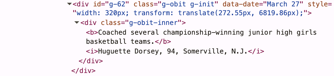
Screen reader technology relies on html structure and ARIA labels to navigate web pages. This meant that if we could not alter the code of the piece itself, we would need to introduce new "framing experience" code and design the structure of the code itself, to ensure the highest quality user experience.
Because the quality of our solution would depend on the quality of the implementation, I investigated the code structure to understand how a screen reader would navigate the piece as built and what was parsable from the existing code structure.


Following a design-thinking approach, I conceptualized our minimum viable product that would satisfy the functional needs of our users - meeting WCAG's principle guidelines of being perceivable, operable, understandable, and robust.
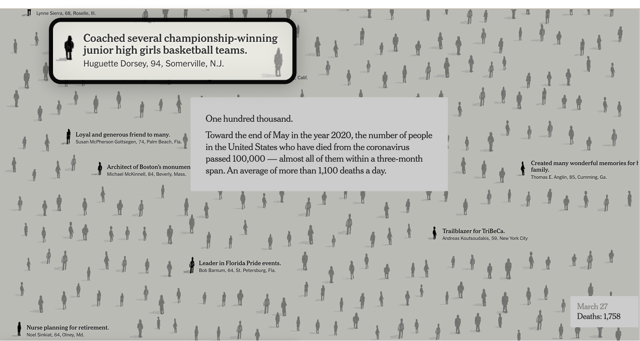
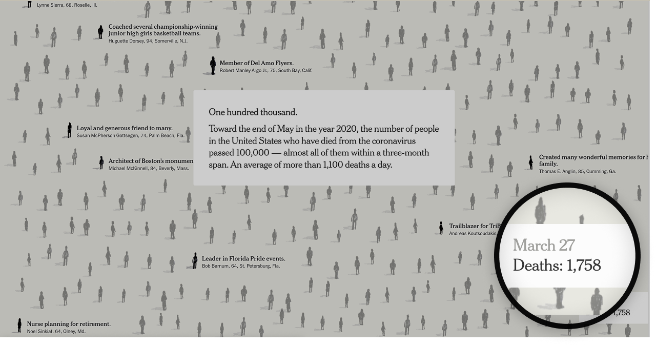
This solution relies on the extraction of each of the three elements (filled and empty narrative boxes, person blocks, and the death count) to populate a linear script that persists on a right side panel. This panel would operates as our frame.
Yes! Because the code's class structure is clean and predictable, a developer could write a python script using python library Beautiful Soup to extract elements from the existing webpage and populate our screen-reader script that appears inline on the right hand of the screen.
Solution
In our panel, we provide the users with two different options for how they can navigate each section. They can either jump ahead, mimicing a large fast scroll or step through each individual's story, mimicing a slow small scroll.
Not every person who uses a screen reader is blind. Following from research conducted at the University of Washington, it's essential not to ignore the visual channel of perception when designing for low-vision users.
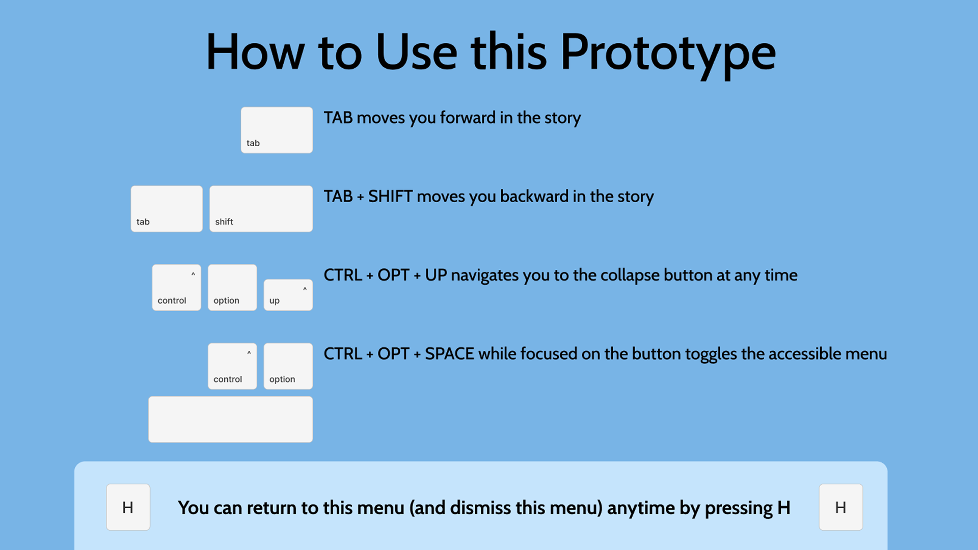
To ensure our client had everything they needed to implement our accessible solution, I built thoroughly annotated wireframes, a diagram highlighting static vs dynamic content, as well as a video-walk through of our prototyped solution.


I loved the attention to detail, creative problem solving and technical consideration required to meet this project brief. I found it incredibley energizing to work through problems of this complexity and hope to do more work like it in the future.

